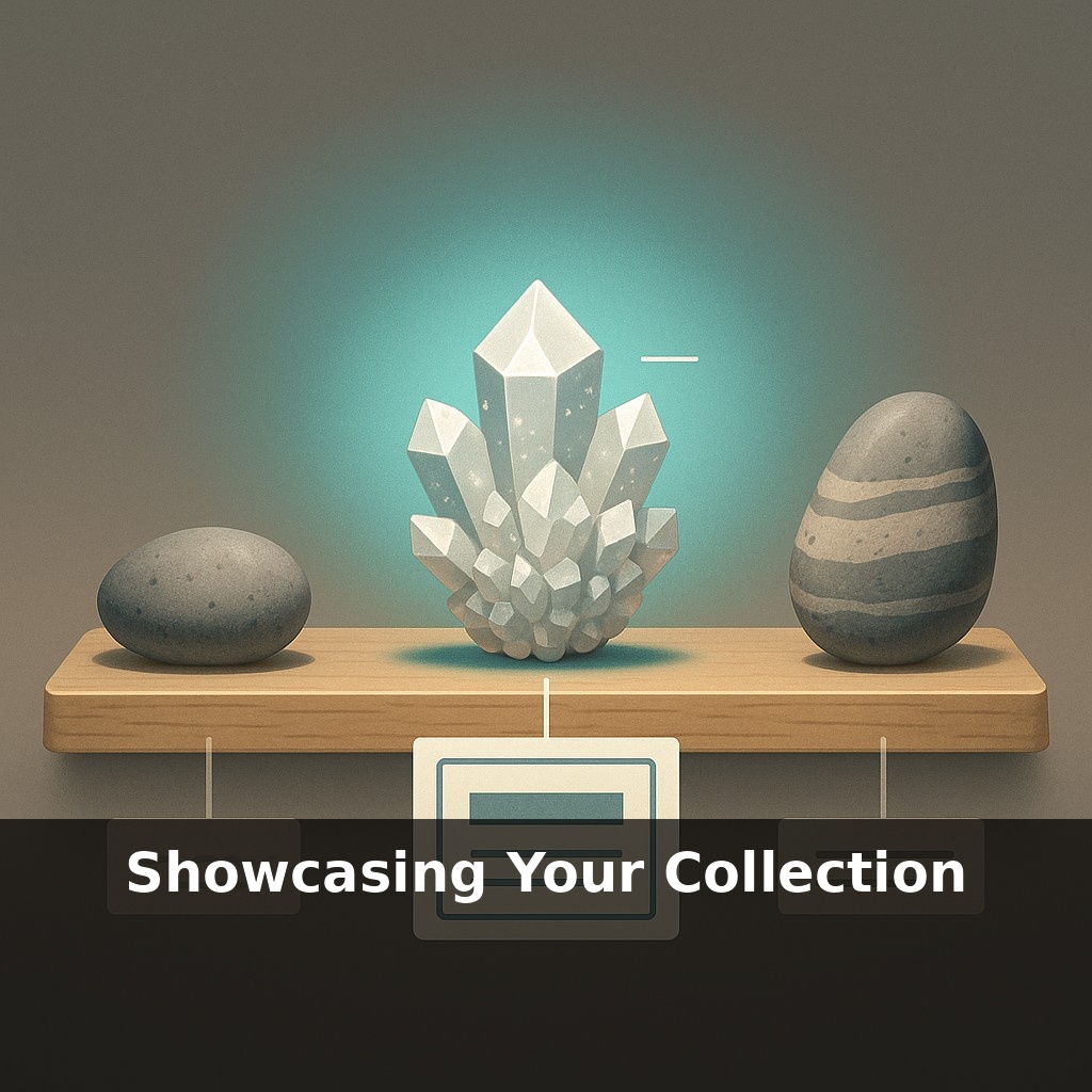
Your rock collection is already telling a story—even if you’ve never planned one. A dull gray pebble, a glittery crystal, a striped river stone: line them up differently, and the story changes. Today, we’re going to tinker with that story so your display stops whispering and starts performing.
“Labels are where most rock displays fail.” That’s how one museum curator put it, and the more you look around, the more you’ll see it’s true: stunning specimens paired with tiny, cryptic text or, worse, no context at all. In this episode, we’ll move from just arranging your finds to actually *communicating* with whoever stands in front of them—family, friends, or visitors who know nothing about geology. We’ll tap basic tools from both science and exhibit design: how a simple line about hardness can change how someone handles a rock, how a note about where you found it can make a stranger lean in closer, how light and spacing can turn a cluttered shelf into a clean, readable “sentence.” Think of this as upgrading from a rough sketch to a full blueprint for how your collection meets the world.
A good way to think about this next step is to borrow a few habits from museums without turning your shelf into a museum copy. Curators rarely just “put things out”; they choose which pieces stay in storage, which get the best light, and which sit side‑by‑side to make a point. They also plan for how people physically move: where eyes land first, how long someone might pause, what detail will reward a closer look. You can do a lightweight version of this at home—deciding what earns prime real estate, what rotates in and out, and how someone’s gaze should travel across a single tray.
“Twenty rocks on a tray” doesn’t sound like a design rule, but it is. Once you go past that—on a typical 60 × 40 cm surface—specimens start fighting for attention, and your viewer’s eye stops reading the display and starts dodging clutter.
So step one is deciding what *earns* a spot. Instead of asking “What can I squeeze in?” try: “What question is this tray answering?” A few examples:
- “How do igneous, sedimentary, and metamorphic rocks differ?” - “What did I find on last summer’s road trip?” - “How does hardness change how we use minerals?”
Pick one question per tray or shelf. Each specimen should support that question clearly enough that, if you pulled it out, the “sentence” would feel incomplete.
Next, think about how to *group* pieces. Three simple schemes work well:
1. **By process** – A mini rock‑cycle layout: volcanic rock next to the sediment it weathers into, beside the metamorphic rock it can eventually become. 2. **By composition** – Silicate vs. carbonate vs. oxide, etc. Even loose categories help people see patterns in color, heft, and crystal shape. 3. **By human link** – “Found with my grandfather,” “From the old quarry,” “Gift from a friend who works in mining.” This is where memory and science can sit side by side.
Within a group, create a visual rhythm: alternate rough and smooth surfaces, light and dark tones, chunky pieces and delicate crystals. One strong, eye‑catching specimen (your “anchor”) goes slightly off‑center; quieter pieces radiate from it. That anchor is where most people will lean in first, so give it your clearest label and your best light.
Speaking of light, favor LED strips or spots angled from above and slightly in front. They cast shadows that reveal texture but keep UV low, which matters for light‑sensitive pieces like amethyst or some organic‑rich rocks. If a mineral has a reputation for fading or reacting, position it farther from the brightest beam and plan to rotate it out—just like museums that only show a fraction of their collections at once.
Finally, leave deliberate negative space. An empty corner or a visible bit of tray isn’t “wasted”; it’s a pause that lets the rest of the display breathe. In a way, that gap does as much storytelling as any rock on the tray.
A practical way to test your layout is to design mini “paths” a visitor’s eyes might follow. Start with three: a beginner path (“pretty / surprising”), a science path (“what is it made of?”), and a personal path (“why did *you* keep this one?”). For each path, pick three specimens that form a clear sequence and tweak their positions until they’re easy to follow without reading every label.
For example, your “science path” might run from a dull, earthy piece to something glassy, then to a metallic chunk. Arrange them in a gentle zigzag so the textures step up in intensity. Use one short phrase on each label that nudges the comparison—almost like captions in a photo comic.
In architecture terms, think of these paths as “circulation routes” through a tiny building: you’re deciding where someone is likely to turn next and what they’ll discover around that corner.
Your challenge this week: set up just one tray or shelf with three intentional paths and then watch—quietly—which one people follow first.
AR and digital “twins” of your pieces will nudge displays beyond the shelf. A guest might point a phone at a specimen and see ancient seas return, or watch crystals grow in accelerated time. Low‑cost scanning could let kids take home virtual copies, like trading cards that carry structure, chemistry, and story. Your physical layout becomes the “home stadium,” while the collection quietly plays away games online—in classrooms, labs, and shared databases you’ve never visited.
As you refine trays and shelves, you’re also sketching a kind of personal field guide. Over time, patterns appear: colors you favor, landscapes you revisit, questions you keep asking. Let those patterns steer your next trip or trade, like drafting a “wish list” map. The display stops at the wall; the collecting journey keeps walking past it.
Before next week, ask yourself: 1) “If a curious friend walked into my space today, what *three* pieces from my collection would I excitedly pull out first, and what story would I tell about each one to show why they matter?” 2) “Looking at where my collection currently lives (shelves, boxes, digital folders, etc.), what’s one specific change I could make today—like rearranging a shelf, creating a small themed display, or photographing a mini ‘highlight reel’—that would instantly make it more inviting to explore?” 3) “If I were to share just one tiny ‘tour’ of my collection this week (a 60-second video, a carousel post, or a single photo with a caption), what would I feature, and how could I use my personality, humor, or personal history to make it feel like an experience rather than just a list of items?”