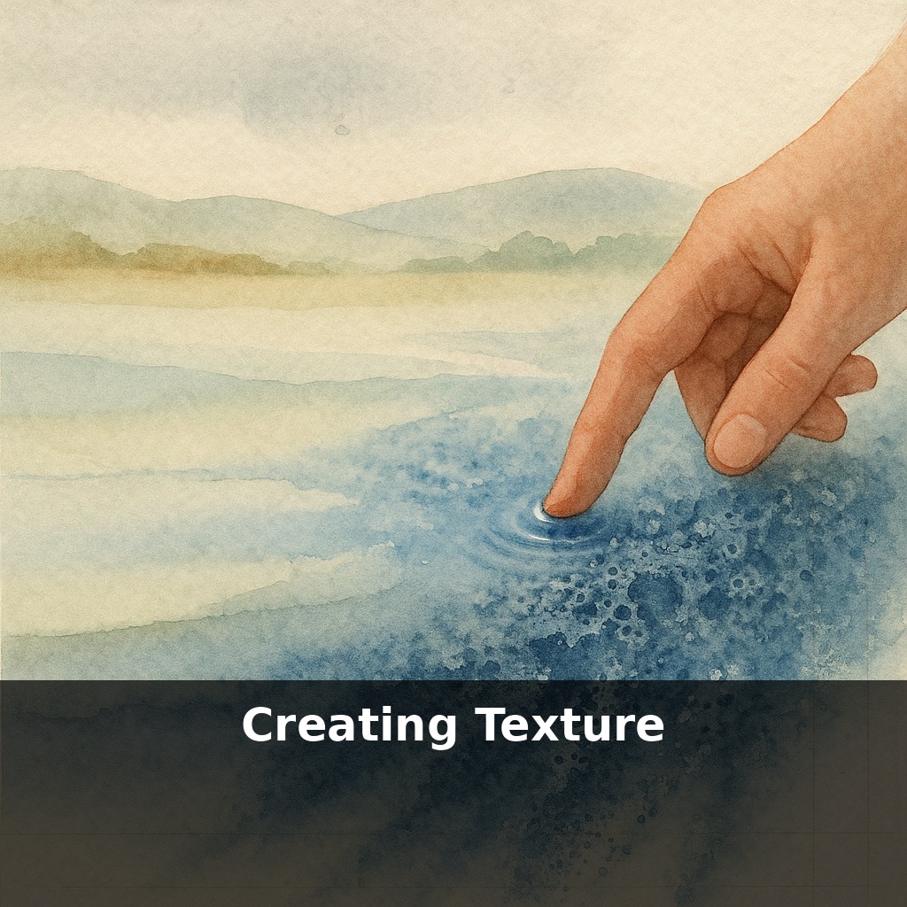
The most lifeless watercolor landscapes usually died the moment the artist tried to “smooth everything out.” In this episode, you’ll step into that dangerous middle stage—while the paint is still breathing—and learn how tiny disturbances can turn flat washes into living surfaces.
“Texture is not a surface quality, it is a structural one,” wrote painter Anselm Kiefer. In watercolor, that structure isn’t built with heavy paint—it’s built in the brief, unstable minutes while water is still making decisions for you.
Up to now, you’ve focused on guiding color and value. In this episode, you’ll start shaping *how* those colors sit on the page: whether they break, bloom, or cling to the paper’s tooth. Think of this as moving from “Is this the right color?” to “What kind of skin does this area need?” Smooth mist, pitted rock, velvety moss, cracked concrete—each asks for a different kind of interference.
We’ll look at three families of tools—crystals, sponges, and blades—and how they interrupt the drying process. The goal isn’t random special effects, but learning to trigger specific textures on purpose, in specific places, at specific moments.
Before you start shaking salt or grabbing a sponge, zoom out and think in layers. The first layer is always the *role* of the area you’re working on: is it background atmosphere, a focal object, or a tiny accent? Backgrounds usually want quieter, broader variation; focal zones can handle sharper, more dramatic marks. The second layer is scale: a cliff face, tree canopy, or brick wall each suggests different “grain.” The third is direction: vertical streaks for rain-soaked walls, sideways scrapes for windswept grass, clustered speckles for stone. Now each tool becomes a way to dial in role, scale, and direction.
Start with the least invasive “interference”: salt. Think of it as a temporary water‑magnet you drop into a damp area. Different grain sizes give you different “resolution.” Fine table salt yields tight, almost atmospheric speckling—perfect for distant stone, sand, or subtle cloud breakup. Coarse sea salt throws larger starbursts suited to bark, lichen, or rough plaster. The trick is to *tune* how many grains you use to the visual weight you want: a light pinch at the edge of a shadow reads as nuance; a heavy scatter across a sky hijacks the whole passage.
Timing decides whether those blooms feel crisp or mushy. If the surface is only just starting to lose its shine, salt grabs boldly, pushing pigment into sharp rims. Wait a little longer and it lifts gently, leaving softer, ghosted spots. Past that, nothing happens—you just have grains glued on top. Use that range: earlier salt for focal drama, later for quiet variation in supporting areas.
Sponges come next when you want texture with a stronger sense of *shape*. Natural sea sponges have wildly irregular pores that stamp organic, non-repeating patterns—great for foliage clusters, rock faces, or broken reflections. Synthetic or kitchen sponges, trimmed with scissors or torn by hand, can be customized for more geometric or directional patterns: brick hints, distant crowds, or mechanical surfaces. Instead of mashing the sponge down, *kiss* the paper with it—minimal pressure, then rotate between touches so you don’t produce a repeating wallpaper motif.
You can also use sponges in reverse: dampen a clean piece and lift color from a nearly-dry wash. This pulls out tiny lights without the hard edges of a brush scrub, suggesting mossy highlights, foam on water, or worn edges on steps.
Blades and cards are your precision tools for inserting bright linear marks into a damp passage. Dragging a credit card corner through a dark, moist stroke can carve in sunlit twigs, roof edges, or window frames in seconds. Because the blade compresses fibers instead of cutting them when used shallowly, those lines catch subsequent glazes beautifully, reinforcing the illusion of light catching an edge. Rotate the card, vary pressure, and break lines intentionally so they read as natural detail rather than calligraphic decoration.
Try this: paint three small swatches, each standing in for a different subject—a city wall, a tree mass, and a stormy sky. On the “wall,” use fine table salt only in the midtones and shadows to suggest pitted age and subtle stains, keeping the lightest areas untouched so they stay structurally clean. On the “tree,” skip salt and work only with a torn natural sponge, turning it like a dial as you move from dense canopy to sparse outer leaves. On the “sky,” forget both and use a clean, damp sponge to softly lift back through a nearly-dry wash, carving out drifting forms instead of stars or speckles.
Notice how each method carries a different kind of energy: salt feels crystalline and static, sponge marks feel clustered and alive, lifting feels atmospheric and unstable. Your challenge this week: limit each study to *one* texturing tool, then do a fourth swatch combining all three—very selectively—to support a single, clear subject.
Studios may soon feel more like quiet labs: papers tuned with micro-ridges that exaggerate granulation on command, salt replaced by eco-safe crystals that dissolve like sugar and leave no trace in the sink. Think of scanning a passage of stone you painted last year, then “installing” it under a new cityscape in Fresco, tweaking the digital bloom pattern like a sound engineer shaping reverb. As these hybrids mature, your raw brush decisions will become modular assets, ready to be remixed across projects.
As you push further, start noticing how your own fingerprints of mark‑making repeat across pieces, like a musician’s recognizable riff. Let some areas stay quiet—broad, unbroken passages give your most intricate passages room to resonate. Over time, you’re not just rendering surfaces; you’re composing a rhythm of rest and complexity viewers can feel.
Start with this tiny habit: When you open a new note, doc, or project file, change just ONE plain phrase into something with texture by adding a sensory detail (swap “busy day” for “Slack pinging nonstop and cold coffee on my desk”). Do it for only a single sentence, then stop. Tomorrow, pick a different sentence and give it one tiny tweak—add a color, a sound, a texture, or a specific object. Over a week, you’ll quietly train your brain to default to richer, more textured language without it ever feeling like extra work.