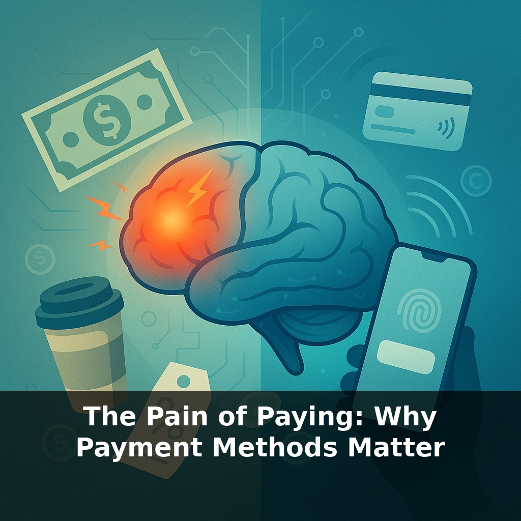
Your brain feels more pain from handing over a twenty-dollar bill than from tapping your phone to pay twice that. Same coffee, same price, totally different sting. In this episode, we’re going to explore why some payments hurt—and how businesses quietly use that to shape what you buy.
A plastic card, a fingerprint, a “Buy Now” button—they all move the same money, but they don’t feel the same to your brain. That feeling gap is exactly where modern payment design lives. In this episode, we’re moving from theory to the real world: why your favorite apps fight to be your “default” wallet, why subscriptions hide renewal dates, and why ride‑sharing firms worked so hard to make cars feel like they’re free until the receipt lands later. We’ll look at how tiny bits of friction—entering a PIN, retyping a password, even seeing a running total—can shrink your spending, and how removing those same moments can quietly expand your cart. Along the way, we’ll see how businesses use timing, visibility, and design choices in payment to tilt decisions you thought were purely about price.
Neuroscientists can actually see the “ouch” of paying light up brain regions tied to physical pain. And that neural wince changes based not on the price, but on *how* the money leaves you. Cash, cards, tap‑to‑pay, BNPL—each one dials that signal up or down. That helps explain why the MIT study found people were willing to bid almost twice as much with credit versus cash, and why companies chase one‑click checkouts so aggressively. In this episode, we’ll zoom in on three levers that quietly steer your spending: when you pay, how visible it is, and how much effort it takes.
When researchers watch how people actually spend, three patterns keep showing up.
First, **spending jumps when payment feels detached from the product.** Pre‑loading a wallet, buying chips at a casino, topping up a transit card, or buying game currency moves the “ouch” to an earlier moment. By the time you’re spending, it doesn’t *feel* like money anymore. Experiments with prepaid cards and scrip systems consistently find higher average spend and weaker price sensitivity once the conversion has happened. Loyalty apps that require you to pre‑load balances (or aggressively nudge you to) are quietly using this separation effect.
Second, **bundling dulls price signals.** All‑inclusive packages, unlimited passes, and flat‑rate memberships take dozens of small decisions and roll them into one. Gyms, coworking spaces, and streaming platforms rely on this: after the initial sign‑up, each extra visit or extra hour feels free. You see this in software “seats” and tiered plans too—once a company buys a bundle, internal teams use more features simply because each incremental action no longer triggers a conscious trade‑off.
Third, **interfaces can either spotlight or hide the meter.** Restaurants that remove currency symbols from menus, digital stores that show images instead of line‑item prices, and travel sites that default to “package” views all reduce how often you confront a clear, separate cost. On the flip side, tools like real‑time budgeting apps increase that salience: as your budget bar pushes into the red, people pull back—sometimes dramatically. Fintech apps that layer “safe to spend today” banners on top of accounts are trying to inject this awareness into the very moment of deciding.
There’s also the **aftertaste** of different methods. Highly frictionless paths—one‑click orders, instant approvals—can win at checkout but lose later. Retailers report that the easiest flows often correlate with higher returns, cancellations, and chargebacks. Some have quietly added micro‑frictions—confirmation screens, review steps, shipping reminders—to cut regret without killing conversion.
For businesses, this creates a trade‑off: design for maximum immediate spend, or design for durable satisfaction and trust. Long‑term winners usually treat payment not as something to erase, but as something to tune carefully.
A quick way to see all this in action is to compare different everyday setups. Take a grocery store that lets you “scan as you go.” As items leave the shelf, your total climbs on a handheld screen. Shoppers often quietly downgrade brands or skip extras before checkout, because each choice has a visible cost. Now contrast that with a meal‑kit subscription: you click once to lock in a weekly plan, then simply choose recipes. The money leaves your account on a schedule, but your attention is on “What do I feel like eating?” rather than “What does this cost tonight?”
Some companies even run A/B tests on payment layouts. One version might show a bold order total at the top; another tucks it below bright photos and benefits. Small shifts in where your eyes land can swing conversion and average order value. Paying with cash versus a one‑tap mobile wallet is like getting the same storm forecast as either a siren or a subtle drizzle icon—the information’s identical, but your sense of urgency changes.
Some of the biggest ripple effects may appear in places that don’t look like “payments” at all. Health insurers could nudge people toward preventive care by smoothing hospital bills into predictable micro‑payments, while climate apps might bundle carbon offsets into everyday purchases so they feel less like a tax and more like a quiet habit. As these invisible layers spread, the real power shifts to whoever decides *when* you feel cost—and when you don’t.
As wallets melt into apps, the real question becomes: who’s scripting your money habits—the interface or you? Your challenge this week: once a day, deliberately choose the *slightly* harder way to pay—chip instead of tap, debit instead of credit—and note how it shapes your choices, the way cooking from scratch changes what ends up on your plate.